Will Inflation Repeat the 1970s Rollercoaster?
XAU/USD
+0.11%
Add to/Remove from Watchlist
Add to Watchlist
Add Position
Position added successfully to:
Please name your holdings portfolio
Type:
BUY
SELL
Date:
Amount:
Price
Point Value:
Leverage:
1:1
1:10
1:25
1:50
1:100
1:200
1:400
1:500
1:1000
Commission:
Create New Watchlist
Create
Create a new holdings portfolio
Add
Create
+ Add another position
Close
Gold
+0.20%
Add to/Remove from Watchlist
Add to Watchlist
Add Position
Position added successfully to:
Please name your holdings portfolio
Type:
BUY
SELL
Date:
Amount:
Price
Point Value:
Leverage:
1:1
1:10
1:25
1:50
1:100
1:200
1:400
1:500
1:1000
Commission:
Create New Watchlist
Create
Create a new holdings portfolio
Add
Create
+ Add another position
Close
CL
+0.52%
Add to/Remove from Watchlist
Add to Watchlist
Add Position
Position added successfully to:
Please name your holdings portfolio
Type:
BUY
SELL
Date:
Amount:
Price
Point Value:
Leverage:
1:1
1:10
1:25
1:50
1:100
1:200
1:400
1:500
1:1000
Commission:
Create New Watchlist
Create
Create a new holdings portfolio
Add
Create
+ Add another position
Close
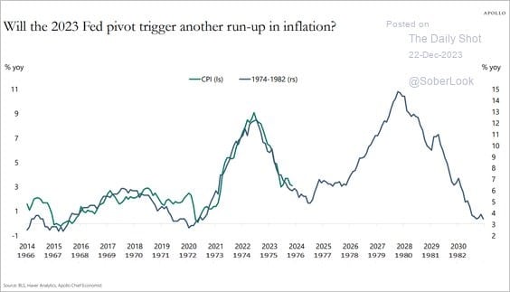
Appreciating Apollo’s graph below, comparing recent inflation to multiple bouts of inflation of the late 1960s, 70s, and early 80s is of utmost importance for investors. 2023 Fed Pivot
Sustained levels of high inflation are poor for stock and bond returns. Even more worrying, high inflation is insidious for the financial well-being and morale of the nation’s citizens. As divided as the country is today, sustained high inflation could worsen it.
To properly assess whether a repeat of 70s-era inflation is possible, we must first understand why inflation was rampant during that period.
With that knowledge, we can compare today with the prior episode to appreciate whether Apollo’s chart is a road map for the future or a spurious correlation.
Due to the extreme importance of inflation on stock and bond market returns, we break this article into multiple pieces. Part One and Two discuss the causes and remedies of the inflation roller coaster spanning 1967 to 1982.
Chart Crime
Before exploring the inflationary environment of fifty years ago, it is worth pointing out that Apollo’s graph is misleading.
First, the two vertical y-axis scales on Apollo’s graph are different. This makes it appear that the inflation rates of the 1970s and today are nearly identical.
Second, the horizontal axis doesn’t compare apples to apples. From 1960 to 1965 (not graphed), inflation fluctuated below 2% a year. In 1966, inflation started to increase consistently.
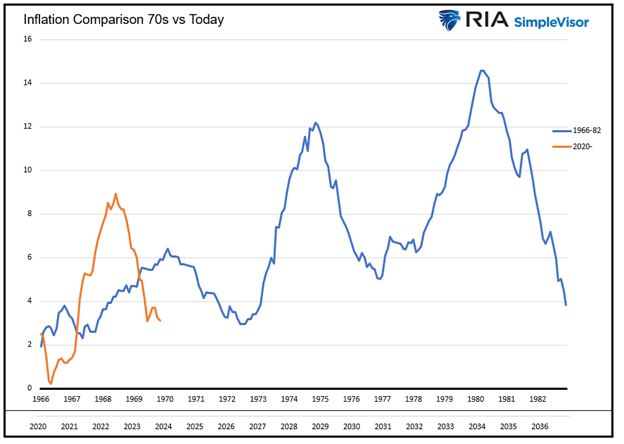
In the modern time frame, the year 2020 is when the wheels for inflation were set into motion.
Therefore, the recent data for comparison should start in 2020, not six years prior, when there was little inflationary impulse. The graph below adjusts both axes and provides a better comparison. Inflation 70s vs Today
While the graph above may dispel worrying similarities, what matters more is the comparison between the two economic environments.
The Great Fed and Government Failure
The Fed and government are primarily to blame for the 70s-era inflation. The Fed acknowledges its faults. To wit, the following paragraph from Michael Bryan, Federal Reserve Bank of Atlanta.
The Fed’s Faulty Phillips Curve
The painful inflation starting in the late 1960s was partly due to a prevailing post-Great Depression mindset. Notably, high levels of unemployment were unacceptable.
To this end, the Employment Act of 1946 tried to coordinate monetary and fiscal policy “” along with a strong economy.
As we will discuss later, The Federal Reserve Act of 1977 amended the Fed’s objectives to add stable prices and moderate long-term interest rates with maximum employment.
However, before 1977, the Fed’s primary objective was low unemployment. At the time, higher inflation levels, while not desired by the Fed, were an acceptable byproduct of meeting their employment objectives.
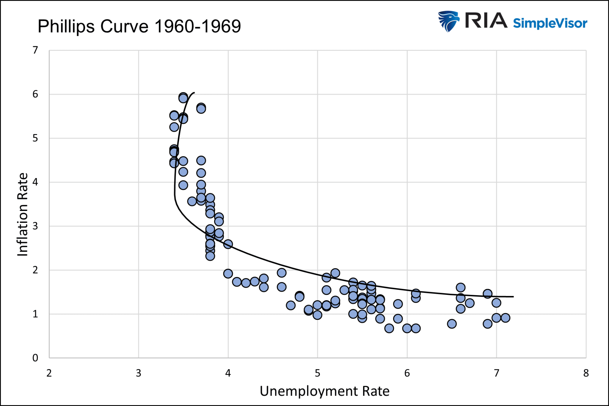
To help set policy, the Fed put a lot of faith in the Phillips Curve. The theory claims that inflation and unemployment have a reliable and inverse relationship.
The graph below shows the inverse relationship between inflation and unemployment between 1960 and 1970. The Phillips curve proved very reliable during that period, further bolstering the Fed’s trust in the model. Phillips Curve-1960s
Like many economic models, the Phillips Curve does not account for human behavior and rational decision-making.
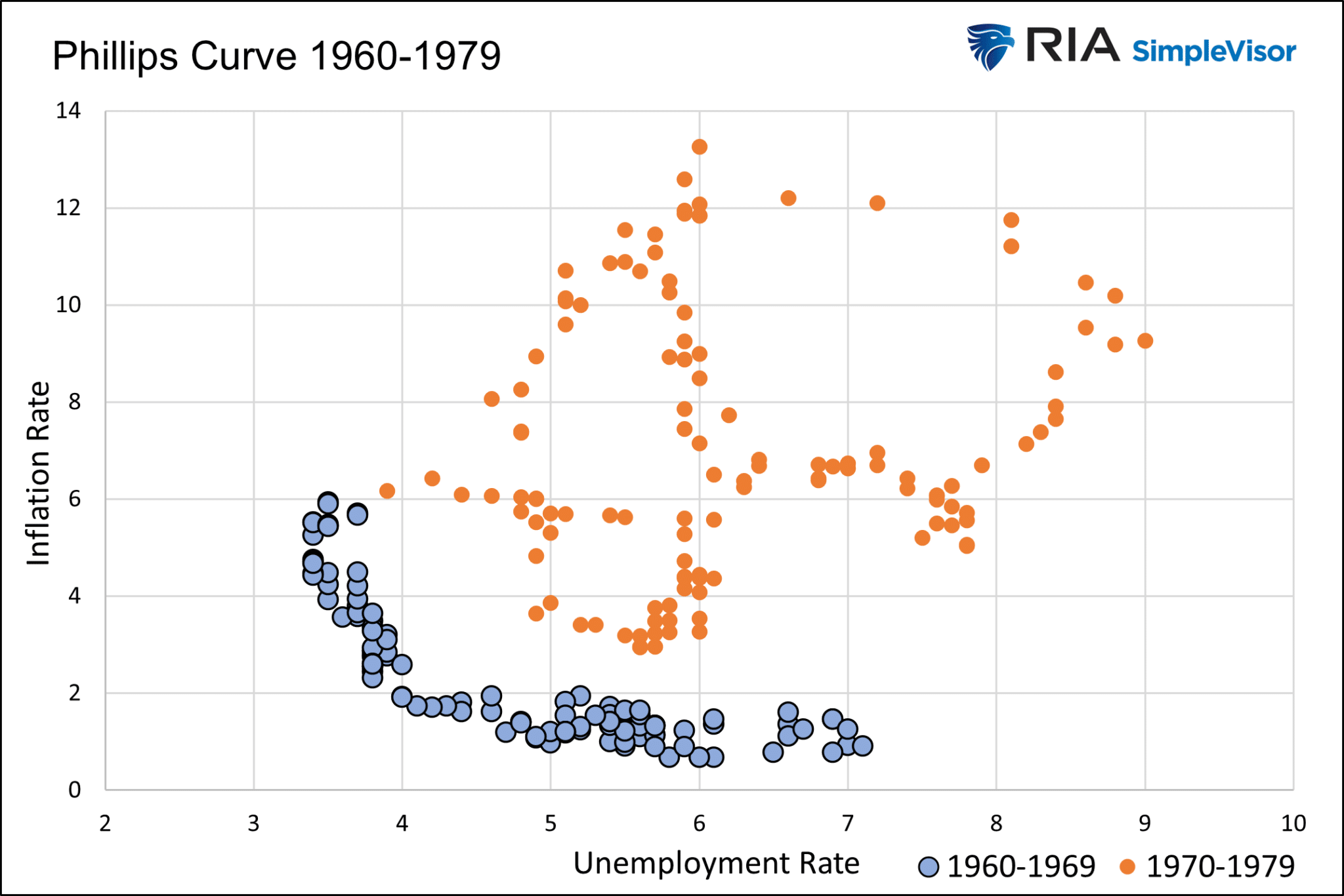
In this case, the Fed failed to consider that rational human behavior would cause the Phillips Curve to shift outward. The Fed didn’t expect businesses and consumers expecting inflation to change their behaviors in ways that promote more inflation.
For example, auto demand may increase because consumers rush to purchase new cars today instead of tomorrow in anticipation of higher prices. Similarly, auto manufacturers may increase prices today, anticipating metal prices will rise tomorrow.
The following graph shows the once dependable Phillips Curve of the 1960s failed policymakers in the 1970s. Higher levels of inflation accompanied higher unemployment. With each peak higher in inflation, unemployment also reached new highs.  Phillips Curve-60s and 70s
Nixon Removes The Fiscal and Monetary Shackles
Not only was the Fed relying on a faulty economic theory, but its ability to administer monetary policy was greatly amplified on August 15, 1971.
The following comes from our article entitled The Fifteenth of August:
With Nixon’s signature, the Fed could use monetary policy more aggressively to meet its employment goals. Equally inflationary, the government no longer had to worry that rising fiscal deficits would spur gold redemptions.
Fiscal imbalances ran high due to Vietnam and increased spending to promote stagnant economic growth. The government no longer had to choose between guns OR butter. It could pay for guns AND butter.
President Nixon removed essential checks and balances on fiscal and monetary policy. The collective actions added to inflationary pressures.
Summary Part One
Part One begins to set the table, allowing us to appreciate some of the causes of the inflation that ravaged America from the late 1960s to the early 1980s.
Part Two will continue the conversation by discussing the oil price shocks, price-wage spiral, and details on how the money supply augmented inflation.
We also share essential lessons the Fed and politicians learned and how a new approach allowed Paul Volcker to bring inflation down for good.
Part Three leans on recent inflationary experiences, allowing us to compare similarities and differences between then and today. This contrast will help you better assess the odds that inflation rides the same roller coaster as it did fifty years ago.


